Landmade Farm Brewery
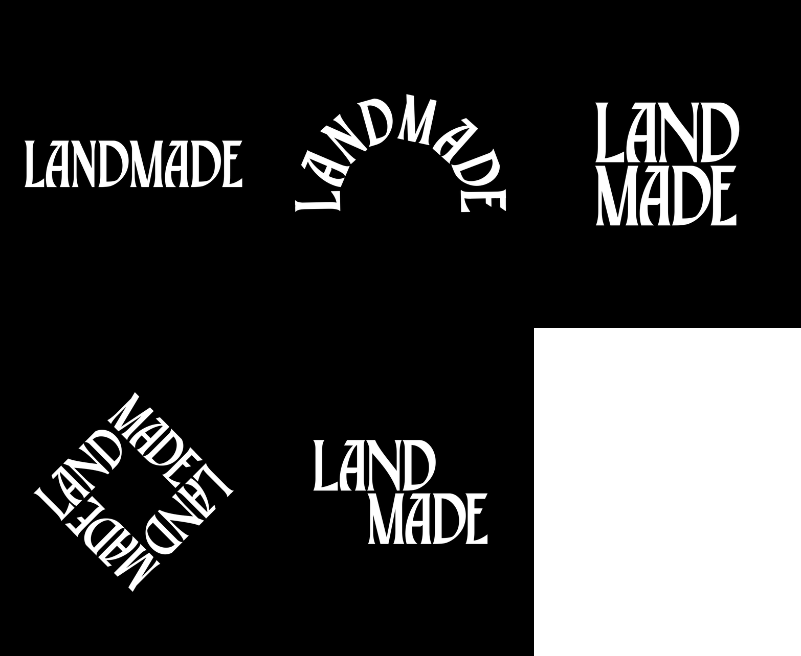
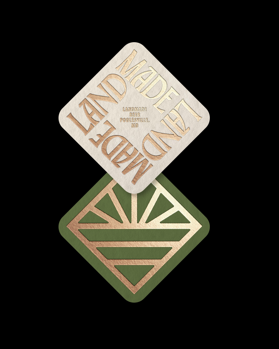
Situated on thirty-three acres of organic orchards and farmland, Landmade is a new destination farm brewery in Poolesville, Maryland. We worked closely with Landmade’s founders to develop the brand’s design system, covering everything from identity and packaging to copywriting and environmental applications.
︎ BRAND IDENTITY
︎ PACKAGING
︎ COPYWRITING
︎ ENVIRONMENT
︎ COLLATERAL
︎ CREATIVE DIRECTION
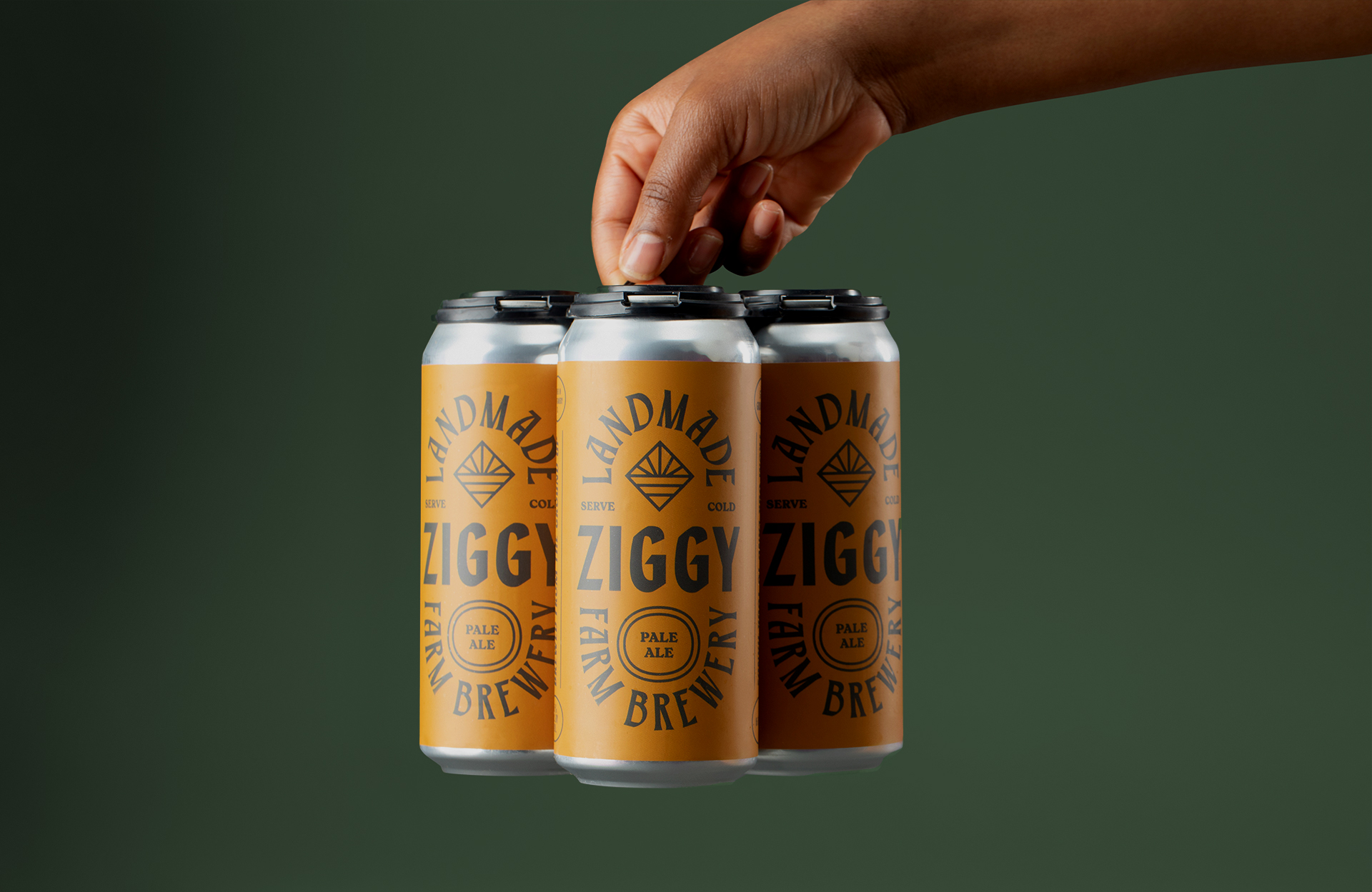

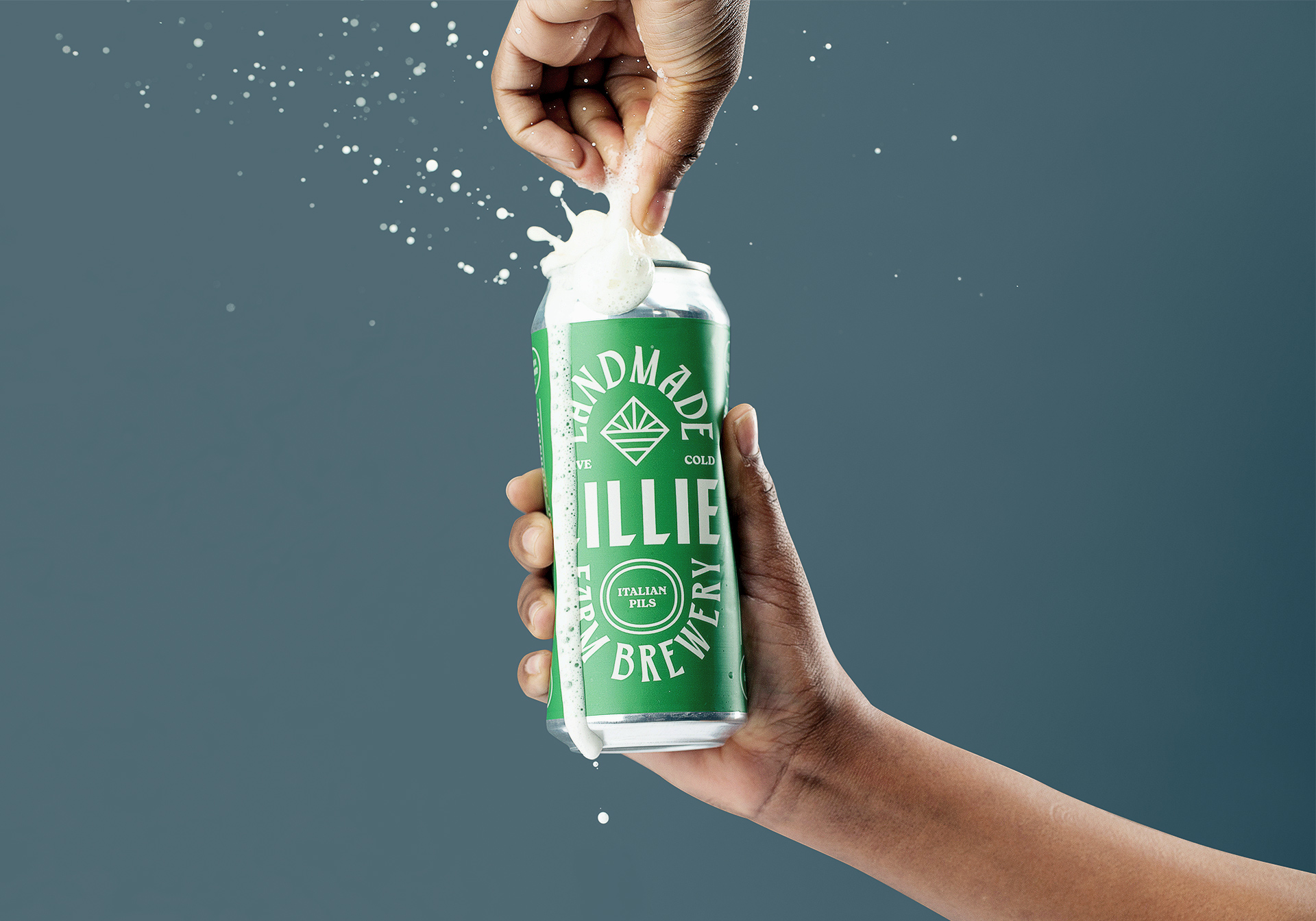


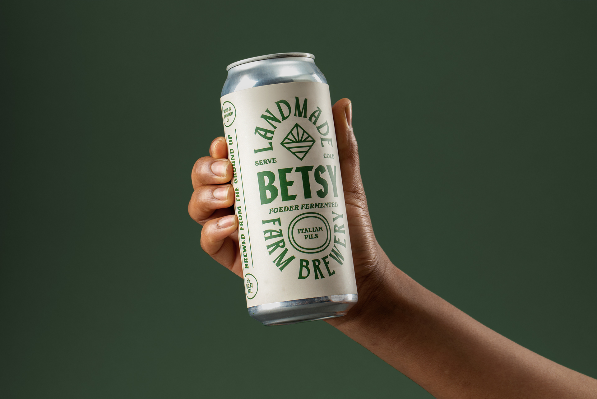
Landmade’s approach to brewing is experimental and versatile, requiring a label system that could easily scale across a fast-growing product lineup.
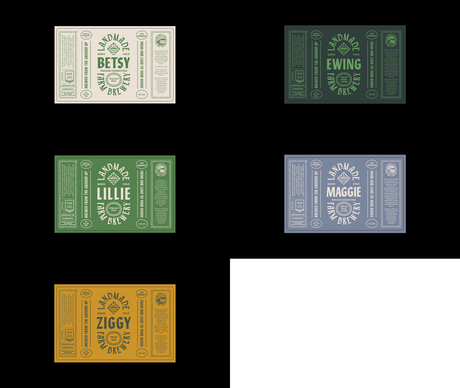
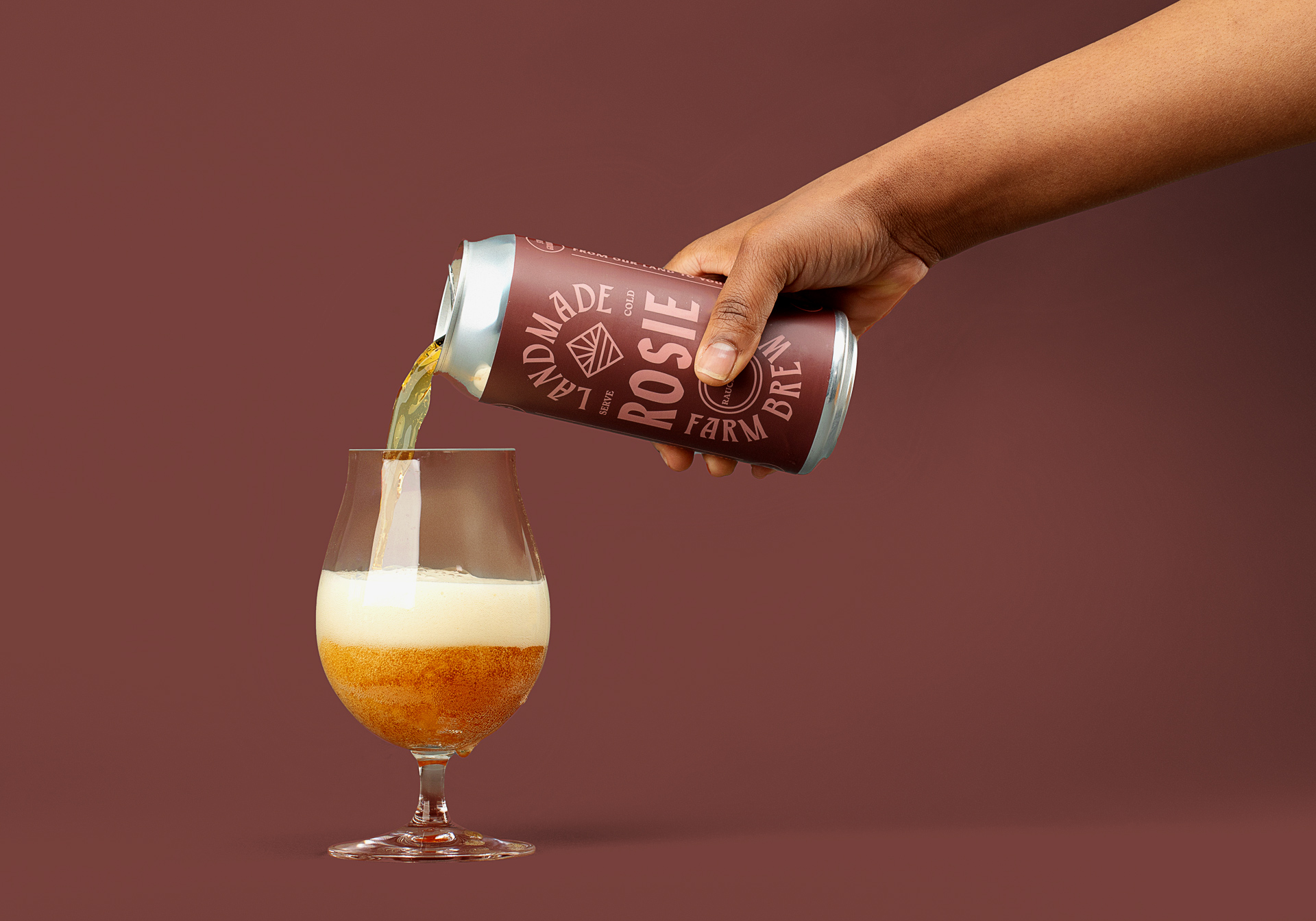
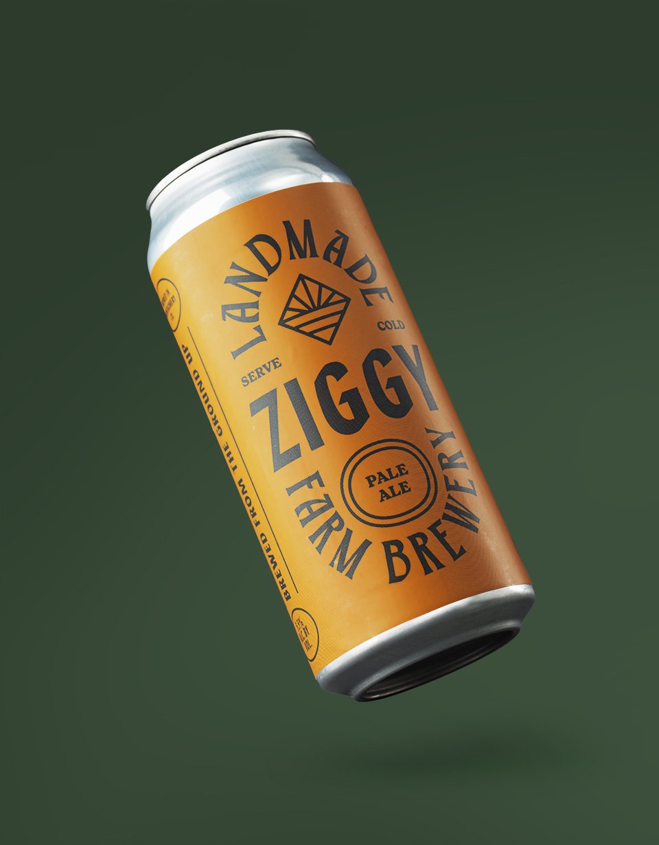
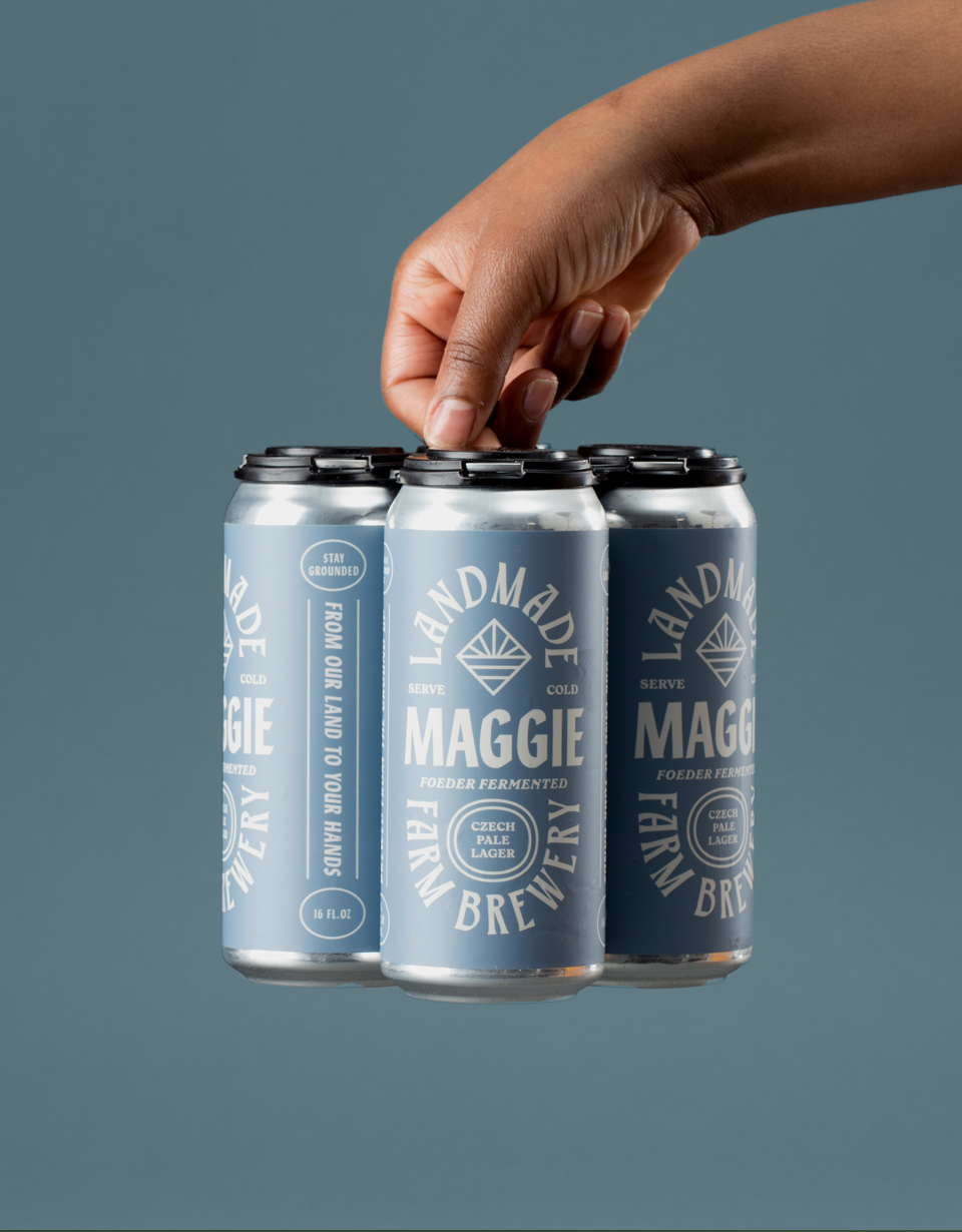
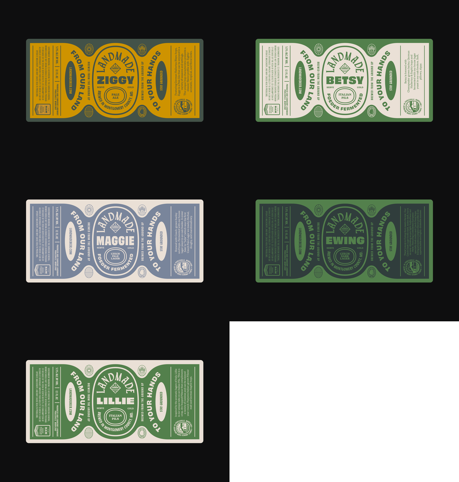
The label layouts feature brand, product name, and style/production notes in a structured, repeatable oval container. Each beer took on a name of the founders’ current or former pets, displayed in a modern, harmonious color palette.
The label layouts feature brand, product name, and style/production notes in a structured, repeatable oval container. Each beer took on a name of the founders’ current or former pets, displayed in a modern, harmonious color palette.
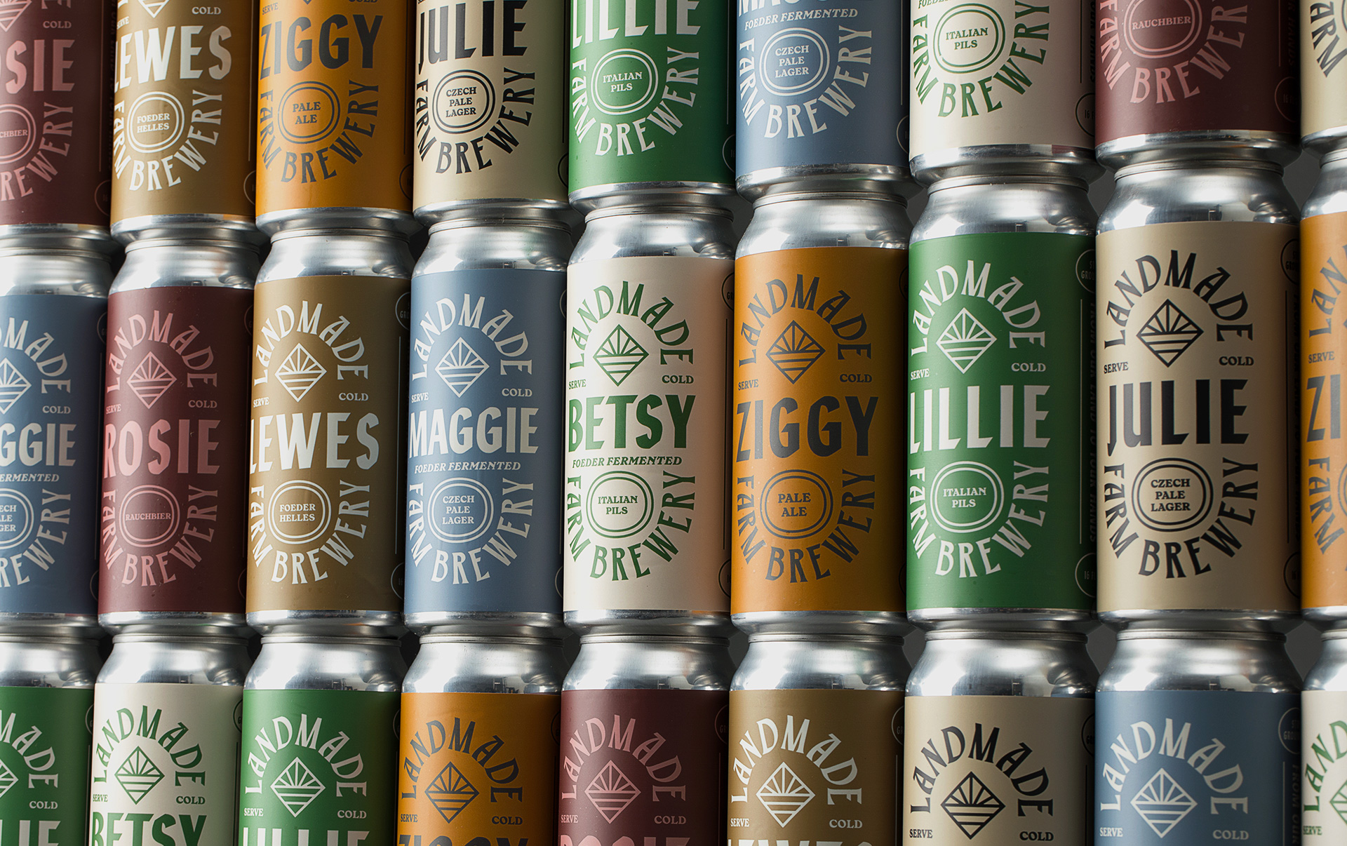
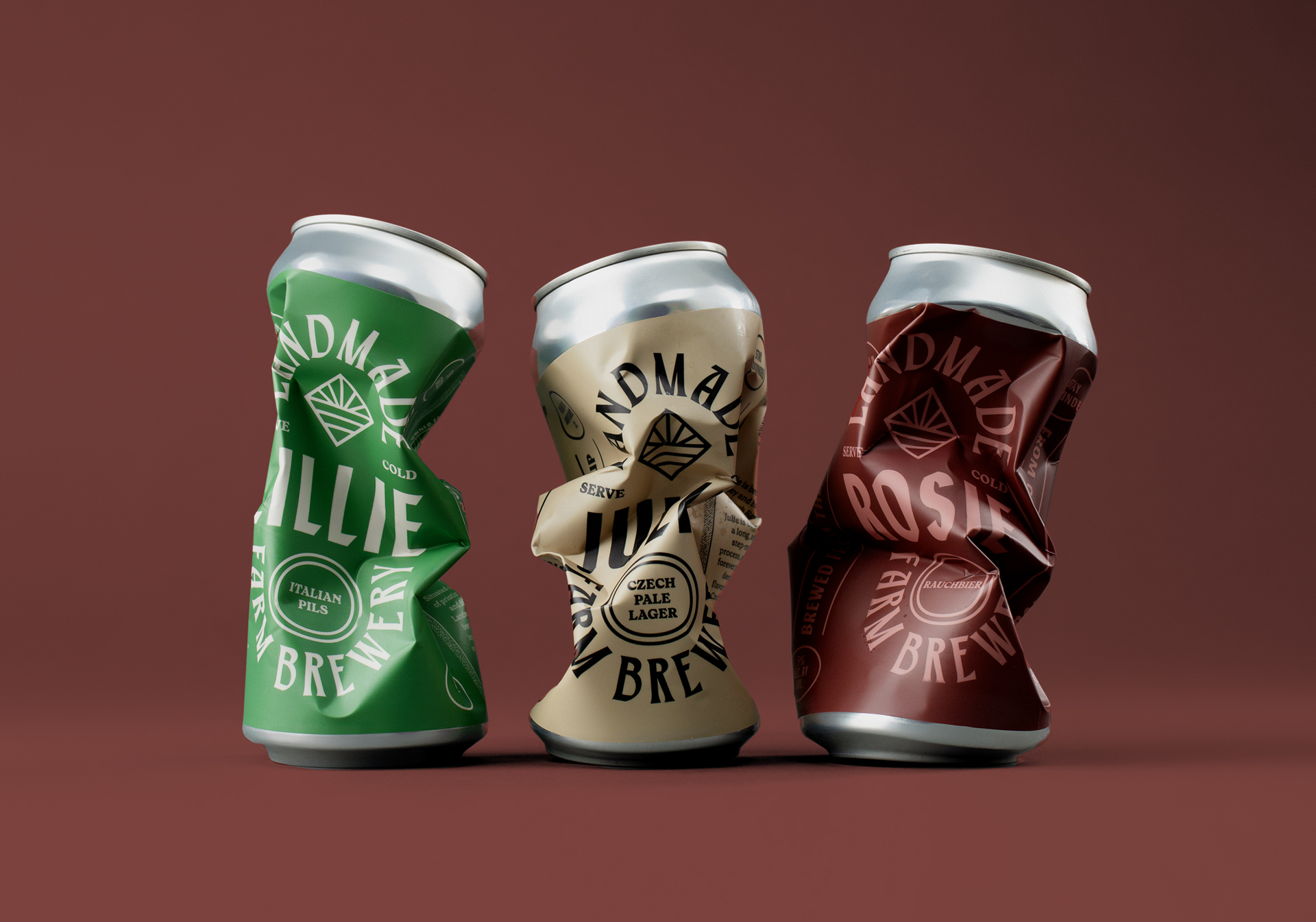
Following the on-premise success of Landmade’s 16oz. tallboy cans, the brewery expanded into regional distribution, requiring a new label system for smaller 12oz. cans.
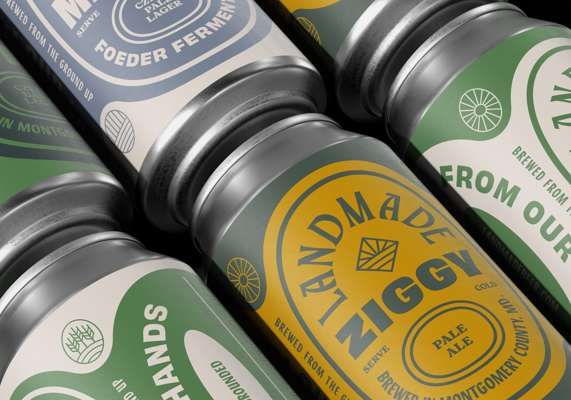
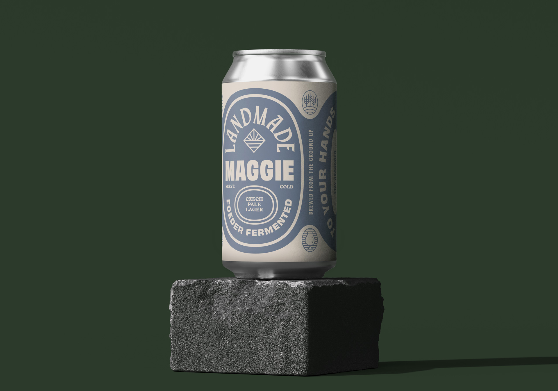
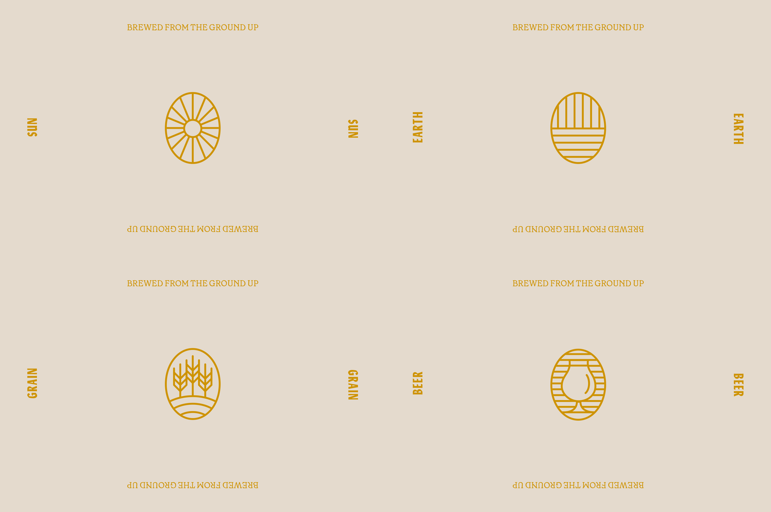
We translated the original label system to a more condensed format, maintaining the original cues while introducing new iconography and typography, and optimizing layout for on-shelf retail display.
We translated the original label system to a more condensed format, maintaining the original cues while introducing new iconography and typography, and optimizing layout for on-shelf retail display.
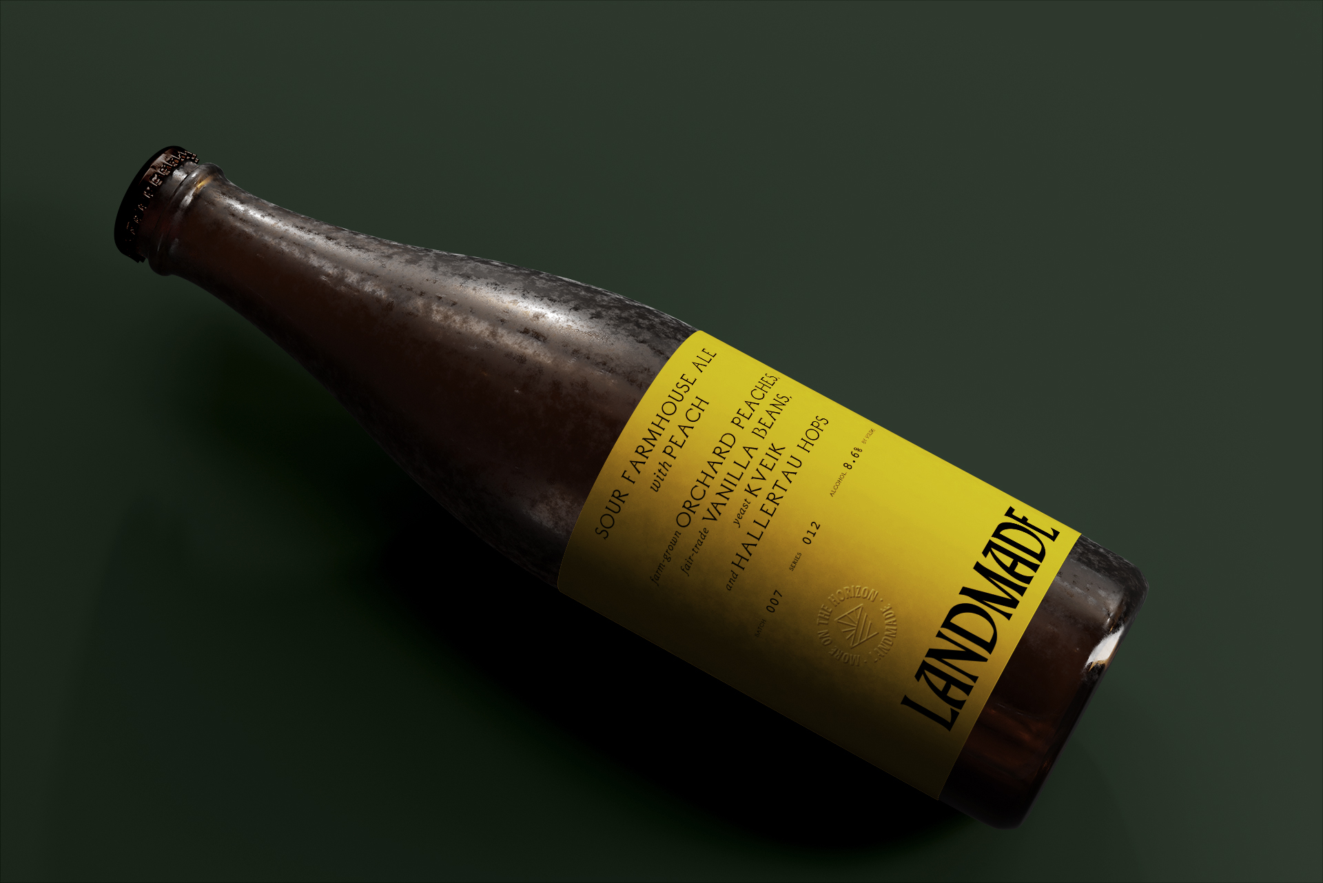
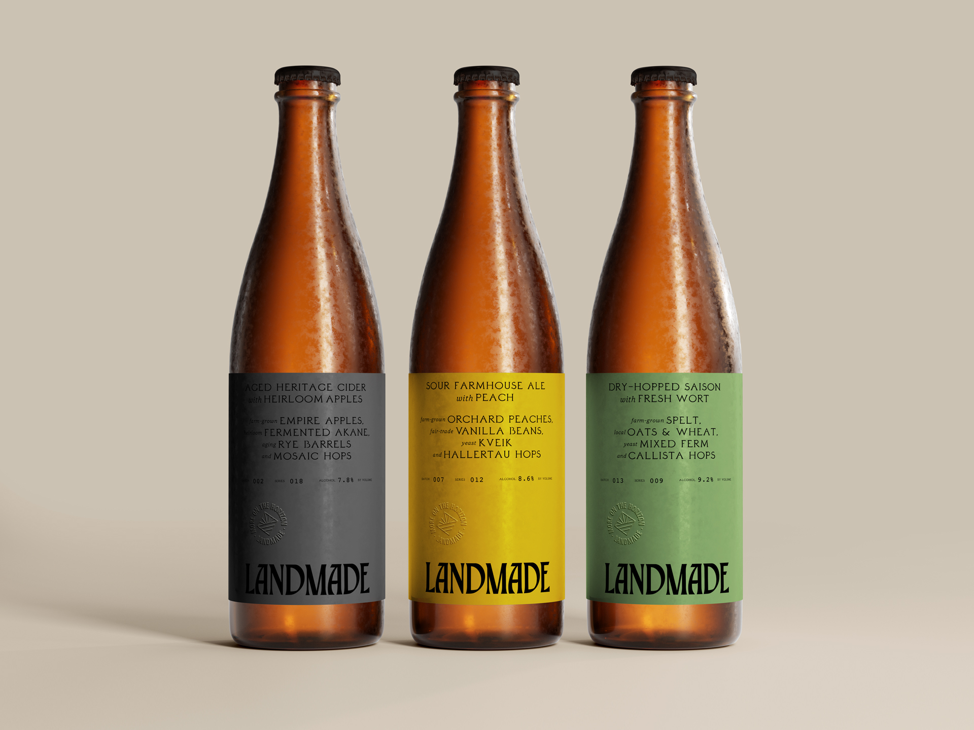
In addition to packaging designs for on-premise sales and retail distribution, we also developed a more premium label execution for seasonal, limited-edition offerings from the brewery.
Featuring a more restrained layout and elevated typographic sentiment, these premium brews showcase experimental production techniques and ingredients grown and harvested from Landmade’s orchards and farm.
